
Transmedia is a buzzy word at the moment. As small studios and developers wrestle with ideas of getting more from their work, more teams are deciding to plan holistic IP – rather than create a single game or film or book these adventurous studios are plotting a web of releases, including video games, comics and movies.
New technology like Unreal Engine 5 is helping teams create larger projects across broader mediums, for example. The team at Studio Hermitage is doing just this with its debut IP, Our Brilliant Ruin. Described as ‘Downton Abbey meets Game of Thrones at the end of the world’, this ambitious project includes a tabletop RPG (currently in Kickstarter), a comic series (to be published by Dark Horse), an audio drama podcast and a video game.
Good Ideas that fall on the cutting room floor for one medium can find a home in a different project
Andy Foltz, art director
Art director Andy Foltz, who has worked on video games Star Trek: Bridge Crew and Werewolves Within before co-founding Studio Hermitage, describes Our Brilliant Ruin as a “sandbox for people to play in”. He explains: “We want to ignite passion and excitement in our audiences and collaborators in a way that inspires them to create their own windows into Our Brilliant Ruin. So naturally different treatments of characters and settings will happen as we work with different people. I think this can contribute to a sense of a big, living world where a variety of expressions exist united by shared characters, places, and themes.”
For Andy, creating a world to use across multiple different mediums from games to comics and films is a joy. “It provides enrichment for people with short attention spans like me to bounce around to wildly different tasks and juggle way too many balls!,” he jokes, adding: “Good Ideas that fall on the cutting room floor for one medium can find a home in a different project. It also provides tighter integration and a really supportive ecosystem for stories and games. When they coincide or are staggered in short succession the various media support each other and provide more avenues for fans to enjoy the world.”
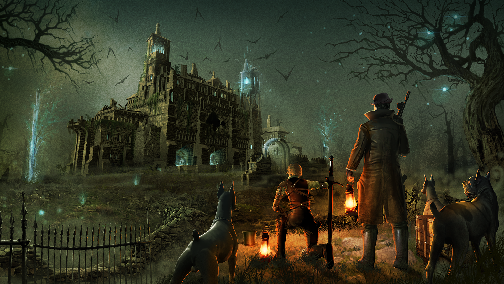
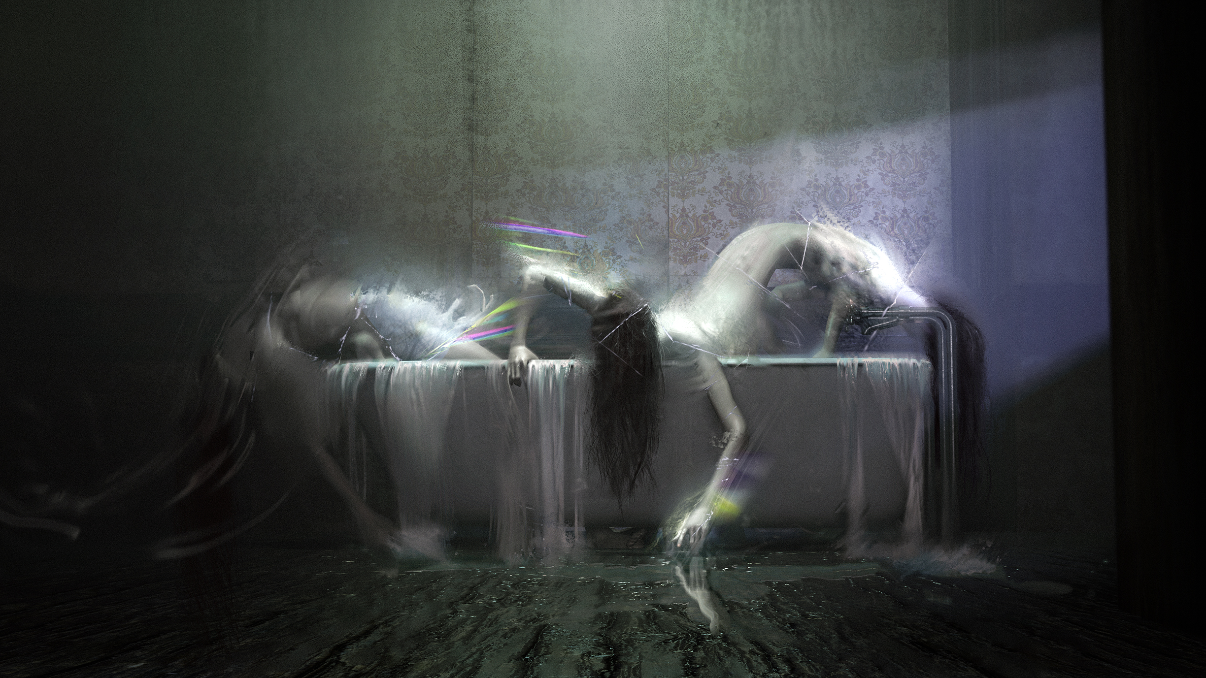
For senior concept artist Efrem Palacios, who has worked for gaming giant EA and franchises including Star Wars, Lord of the Rings, Magic: The Gathering and Hearthstone, before joining Studio Hermitage, its the spread of types of project and media that makes working on Our Brilliant Ruin feel freeing.
“The sky’s the limit!” he exclaims, telling me: “Working on a video game or a movie instantly has limitations because you are painting a picture or telling a story from point A to point B. Our Brilliant Ruin was always going to be more than just one story, but a world much like Star Wars and Blade Runner (which are inspirational properties to me), according to how their cult fans see them as limitless for storytelling and imagination.”
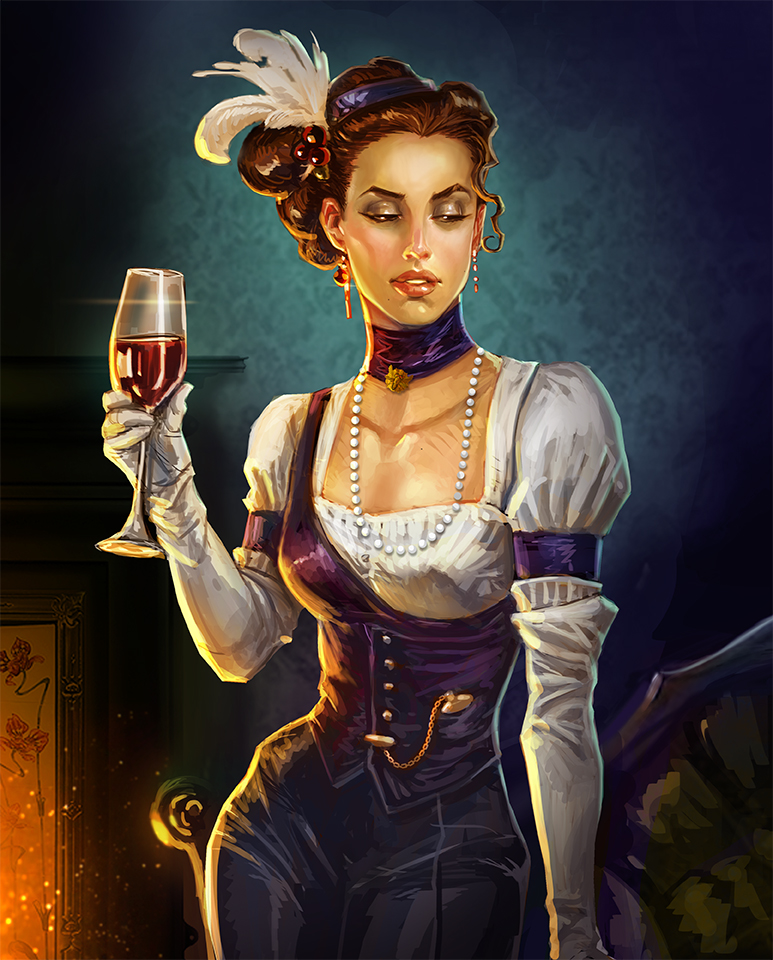
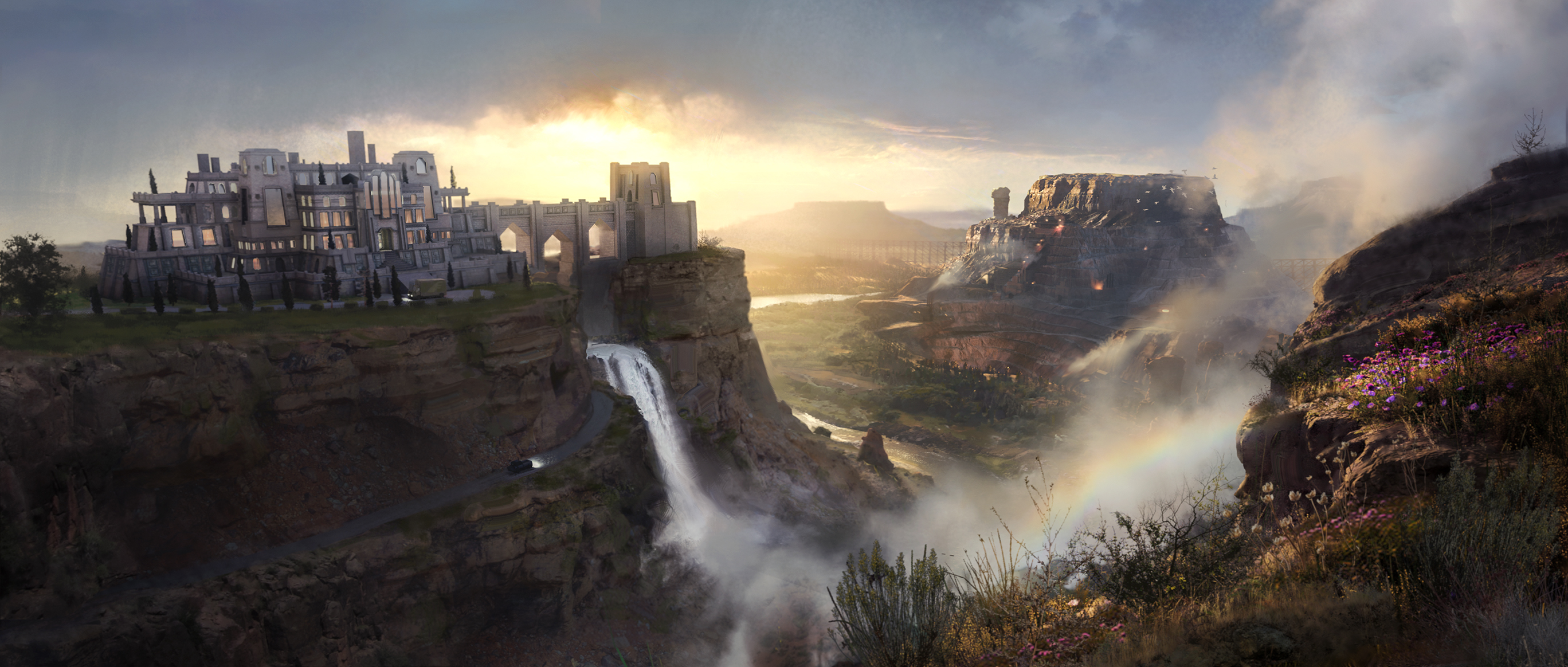
The world being crafted by the team is a chaotic, lawlessly decadent place on the edge of destruction as ‘The Ruin’ slowly eats away at the world. This catastrophe has left the world Dramark in stark decay, society’s boundaries have crumbled and the only thing holding life together is the remains of a class system. No wonder the hedonism of the Art Nouveau and Art Deco periods have been an influence. (Read my piece of the art of video game Song of Silence if you like the sound of an Art Nouveau game world.)
Daily design news, reviews, how-tos and more, as picked by the editors.
“The arts and culture of the Belle Époque have a huge influence on everything about Our Brilliant Ruin,” reveals Andy. While the artists of this era have been an influence, Andy tells me the art team has sort to include broader but associated styles into order to crafter a unique but harmonious world.
Art from Mucha and J.C. Leyendecker has been used as source material, but the art team has also been inspired by people including Ernesto García Cabral, Beatrix Potter, Alfonso Lannelli, George Barbier and N.C. Wyeth.
“I’ve tried to embrace the wide variety of the period, and think about how the various movements spill into each other and evolve gradually into something else,” explains Andy. “Everything is always more complicated than it first appears and sometimes what seems like an anachronism is either just our ignorance of the past or the fevered imaginings of a visionary eccentric.”
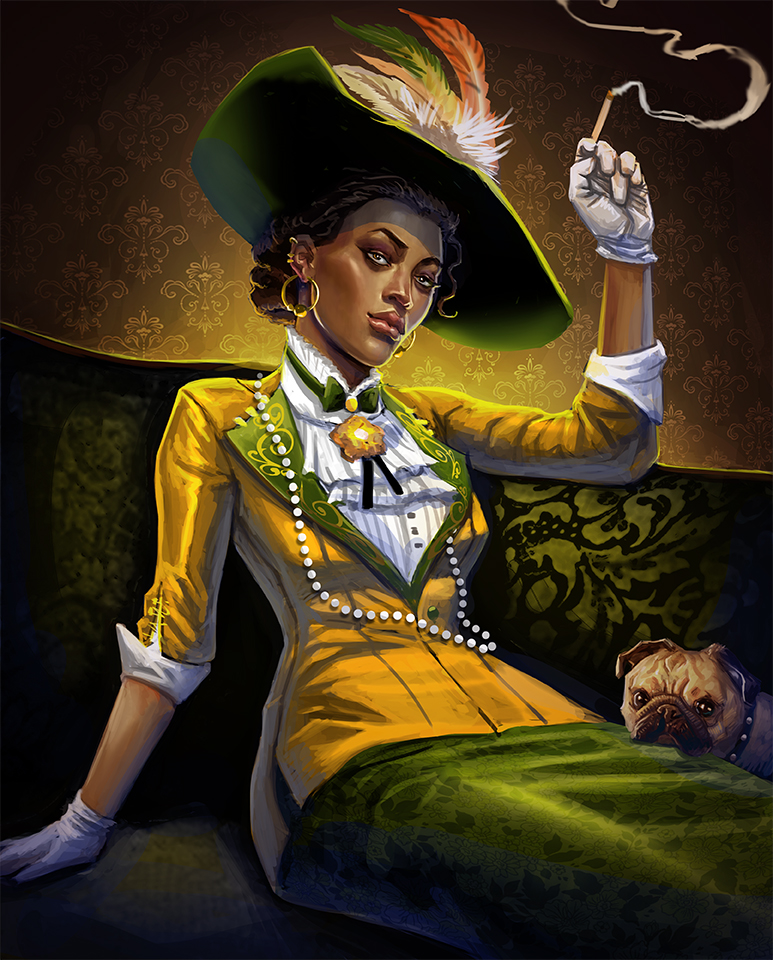
Efrem says: “Our Brilliant Ruin just so happens to exist close to our world’s most inspiring art periods for me, where the romantic world crashed with the industrial one. And because Our Brilliant Ruin exists in a similar era but ‘rubberbands’ like our own, you can be inspired by such greats like Mucha, Wyeth and the Brandy Wine Gang, JC Leyendecker, Toulouse-Lautrec, Auguste Renoir and even Picasso.”
Andy shares how the Art Nouveau and Art Deco eras also inspired some more than just character and environment designs. The “processes of that era are also a source of fascination and inspiration,” he says, explaining how manual typesetting and hand lettering are processes he’s explored in creating the tabletop RPG’s layouts and book designs.
The art director adds: “Without digital type, people had to use a different font for different sizes of text. So there are lots of examples from the past with a lot more typefaces in a design than is fashionable today. It’s an excuse to commit some typography crimes (on purpose, I swear!) and play with some Dada sort of compositions.”
The steampunk-fantasy-horror world of Our Brilliant Ruin is a complex and inviting one, with artistic inspiration as diverse as Simon Stålenhag, Johan Nohr, Abigail Larson, Becky Cloonan, Aaron Horkey, and Mike Mignola. So how does an art team maintain consistency across all of its projects?
“Even within the one medium of our tabletop RPG book we have a really wide variety of styles and treatments,” explains Andy. “To wrangle these we’ve embraced some of the chaos and allowed, and celebrated, the differences where possible because this reflects some of the chaos and eclectic variety of the ruined world of Our Brilliant Ruin. But to bring them together in a way that feels like Our Brilliant Ruin we’ve used a grid for our layout, some (but not total) consistency in typography, repeated elements, and a finite palette of colours.”
Efrem adds: “Our world has multiple styles and approaches to art and to make things feel real. We did the same and I feel we’ve embedded that with the overall design of the world from its graphics, typography and architecture.”
Our Brilliant Ruin is a little unusual in that it doesn’t have a singular or central narrative to craft a visual design around, instead the team is building a robust world where many stories can be told in a mix of styles and mediums. The project has fostered a unique non-linear and organic approach where all ideas have been welcomed.
Where characters or ideas have a had a direct historical influence, Andy says finding creative solutions has been easier than when an idea is looser or “chaotic”. This was a challenge when it came to visualising the Unbonded faction.
Andy explains: “They are inherently a bit chaotic and individualistic so pinning down their look is like herding cats. Sometimes with problems like these, it helps to put them on to the back burner while other parts of the world get fleshed out. When more pieces are in place, new solutions begin to form out of the collisions and juxtapositions of these other elements.”
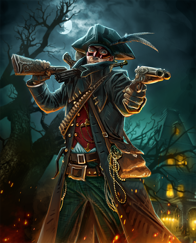
The Unbounded were designed from an unusual influence, 1980s pop band Adam Ant. But as Andy explains, this caused a clash. “Placing that 18th-century style into our late 19th-century and early 20th-century inspired world could be jarring or too contrived,” he says, adding: “But later when we were talking about the prior history of the Dramark and how the oceans were corrupted in the early stages of The Ruin’s influence, I thought about how there must have been massive upheaval in all the sea-faring and naval jobs and industries.
“Thinking about this in the context of our Unbonded faction I realised this displacement could be part of their origin and they might hold on to some of their old naval garb or appropriate some of the older hats and coats as a symbol of their own disconnect and outsider status in the withering society of the Dramark. This connection to a lore element helped ground and enrich our solutions for the Unbonded.”
For Efrem the challenge, and the fun, of working on a transmedia project like Our Brilliant Ruin has been establishing the rules of this game’s world. “Our Brilliant Ruin was never pitched to me as just one thing but a living world, and it’s been fun pitching which toys can stay or go in this potentially huge toy box of a property,” he says.
Pulling the strings together of such a complex project and building a consistent world has meant developing good communication amongst the team, affectionately called the ‘Hermits’. Learning who the game’s subject experts has been a good way to ensure designs land perfectly.
“Like with our maps,” says Andy, “I could look at Evan’s sketches and think, “I like the variety of biomes and the geography seems to make sense,” but Rachel (Wilkinson), our senior writer could tie together and integrate all these details of lore and history with a closer consideration of how that matched the geography – a level of abstract detail that is just over my head.”
Andy has a unique approach to getting from A to B in a concept. He explains: “When possible I try to remember to suggest the goal or desired outcome rather than a solution. It’s no fun to be told what to do, and I want to facilitate some pride and investment in our work together.”
Efram says team work is key to delivering a transmedia project such as this: “We are in constant communication with each other and the ‘Hermits’ have always emphasised a culture where the entire team shares and participates and that communication is key to nurturing this baby we call Our Brilliant Ruin to grow.”

Aside from communication and relying on the team’s experts, Andy says his approach to world building is about pulling at a thread of everyday life for the game’s inhabitants and “see where it takes me”.
Being a good concept artist is about being a good storyteller. Andy takes me on a journey into how he unravels the world being created, and where it can lead his designs. He asks questions, “If metal is scarce… what do regular people use to cut things?” So they use ceramic blades. “So let’s explore that; ceramics can be brittle, what do people do when the blade chips or shatters? So we think again and imagine replaceable ceramic blades like utility knives or safety razors.”
Andy continues down a rabbit hole of ideas, one leading into another. Maybe there are companies creating countless disposable ceramic cutting edges, perhaps these are discarded and littered around the world, in parts of Grandhurst. An innovative Unbonded person could collect these shards and attach them to a cricket bat, and now a “unique weapon grown out of the constraints of everyday problems,” teases Andy.
“Like cooking spaghetti, whatever sticks to the wall I call it cooked.”
Efrem Palacios, senior concept artist
He adds: “I find these mundane things can lead to interesting and sometimes unexpected conclusions. Sometimes solving one problem creates another. Maybe the world is just a tangled rat-king of problems.”
Efrem is a little more succinct in his summery of his world-building process, joking: “Like cooking spaghetti, whatever sticks to the wall I call it cooked.”
The senior concept artist has also looked closer to home when implementing ideas. He couldn’t help but insert his pug Gus into then world, turned into a female and named Precious of the Valgreave family, a dog that gets around the game’s world and is often seen in the most random places.
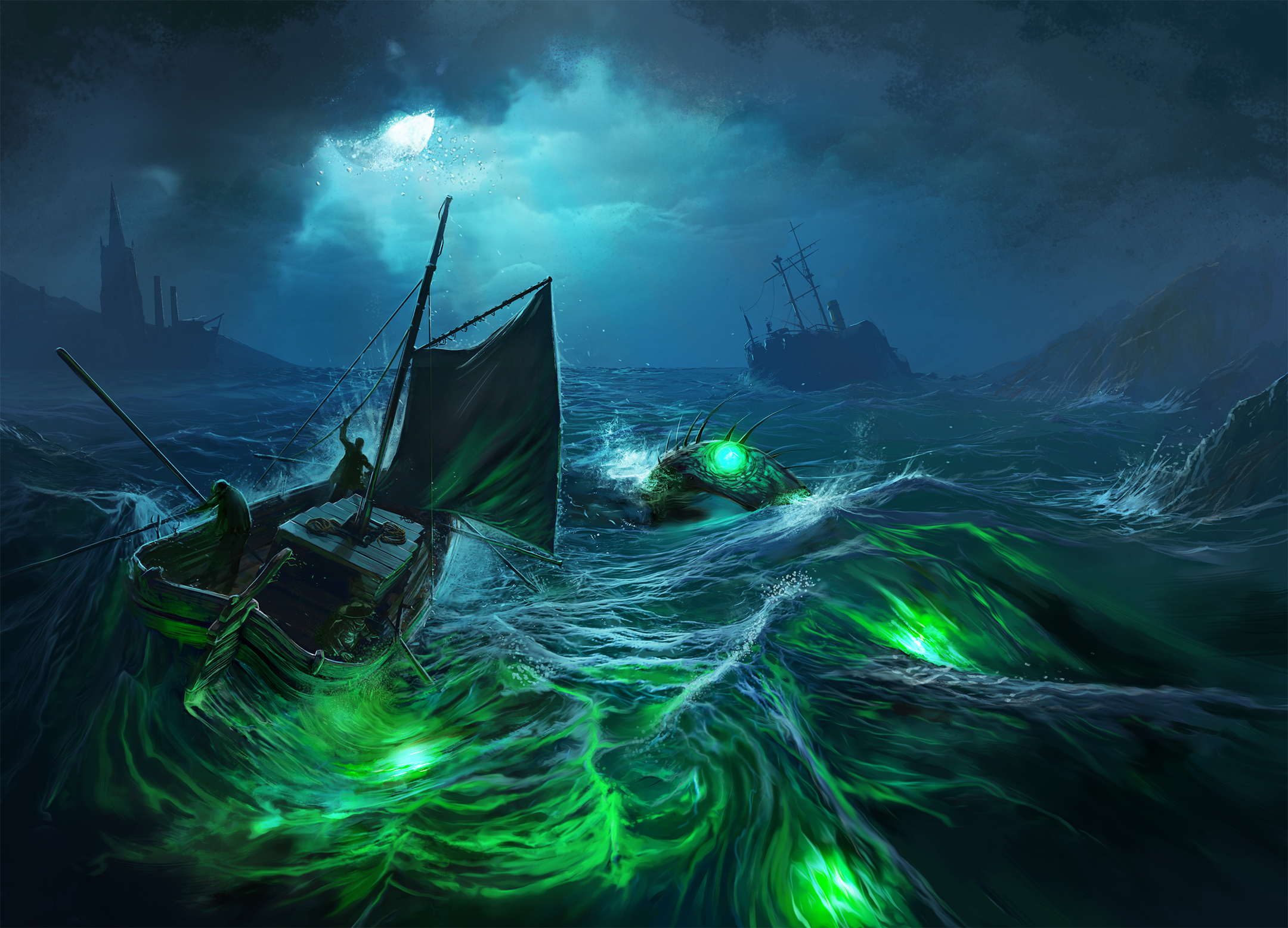
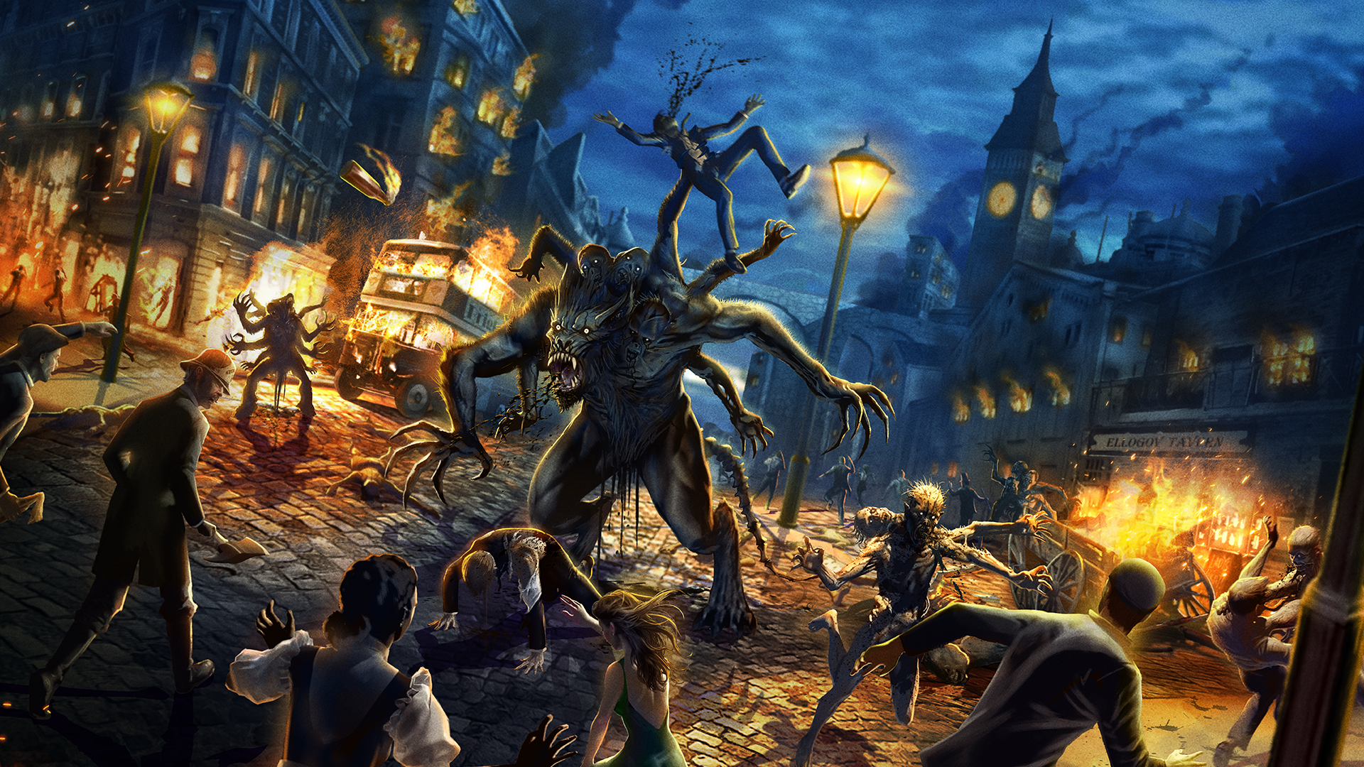
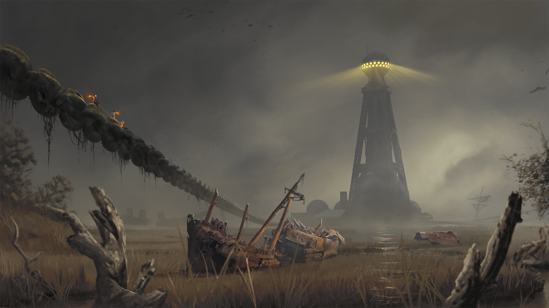
“One other thing I like to maintain about Our Brilliant Ruin is to keep people on their toes,” says Efrem. “Once you start settling in on Our Brilliant Ruin thinking it’s just an Edwardian world suddenly you’ll see a Baboon in a three-piece suit, or a Ruined monster whose body horror sticks with you at night, or a giant Sylokinetic [machine] flying through the sky that makes you go… “What the hell is that about? I better keep looking into this”.”
When it’s come to software and apps the team has used near enough everything, including ZBrush, Adobe Photoshop, and Adobe Illustrator. Andy tells me he loves using Blender, Krita, and Inkscape as well. Efrem manly uses Photoshop, but has used Maya and ZBrush.
“We use any tool we can to get the job done,” says Andy, which has also included Unreal Engine 5 for concept art, prototyping and lighting scenes. “It came in handy when we had a really quick and dirty high-poly model of one of our giant Sylokinetics [massive ancient machines that roam the world of Dramark]. The dense mesh was humbling Efrem’s computer in conventional 3D applications so we threw the model into Unreal 5 and let Nanite work its magic. Within minutes we could zoom the camera around this monster and had beautiful lighting.”
When it comes to the specifics of designing for a world to use across different mediums the artists play to the strengths of each, whether that’s the interactivity of video games and tabletop gaming that requires a non-linear narrative approach, or the visual storytelling of graphic novels. They have created a “library of concepts and open-ended suggestions of styles,” says Andy, that can be used internally and by commissioned artists expert in their medium.
“We must make sure the rules of the world stay as intended and don’t go off the handle just for any particular genre or medium,” says Efrem.
When designing characters for a transmedia project, and in general, Andy says it can be helpful to think in terms of graphic design fundamentals, “because designing a character can be a little like designing an icon or a logo”.
He continues: “You have to think about a memorable, catchy silhouette, and then consider what details are important, what can fall away, and what won’t work at different sizes. Mario, the world-renowned plumber is a good example; he started as a handful of pixels and has evolved into live-action and full CG motion pictures and real-time 3D video games. All of these are valid expressions of Mario, each adapted to the target medium.
“Just like Andy’s example of Mario, Our Brilliant Ruin as a property could inhabit multiple styles and approaches,” illustrates Efrem.
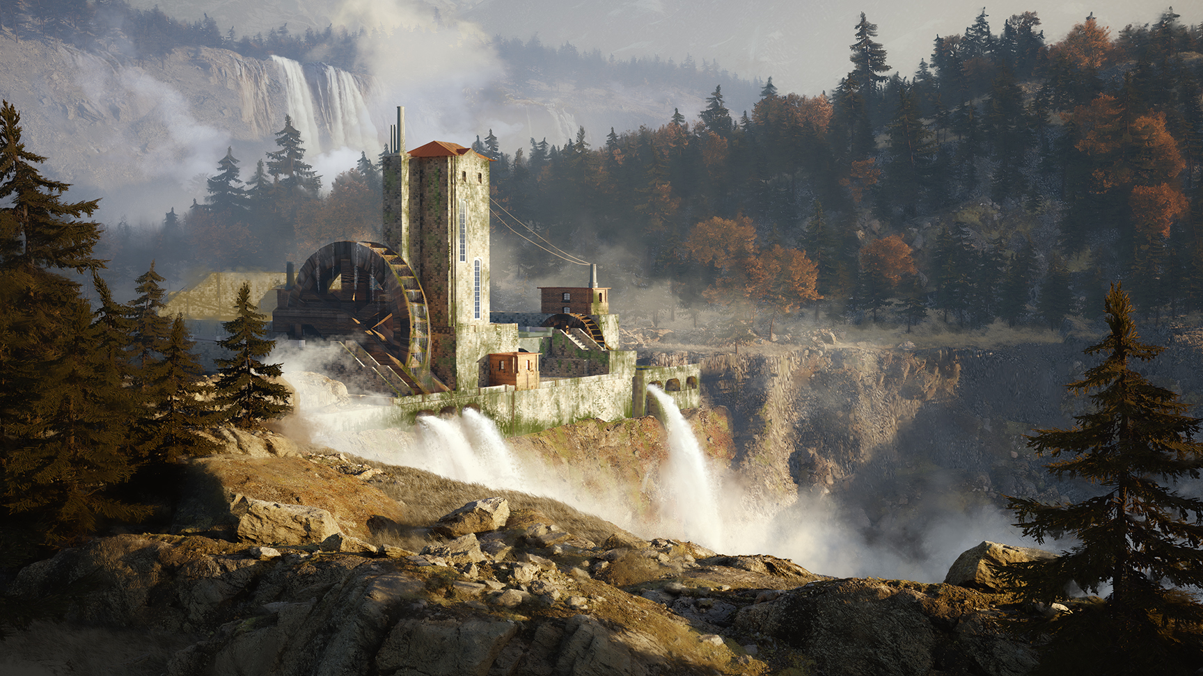
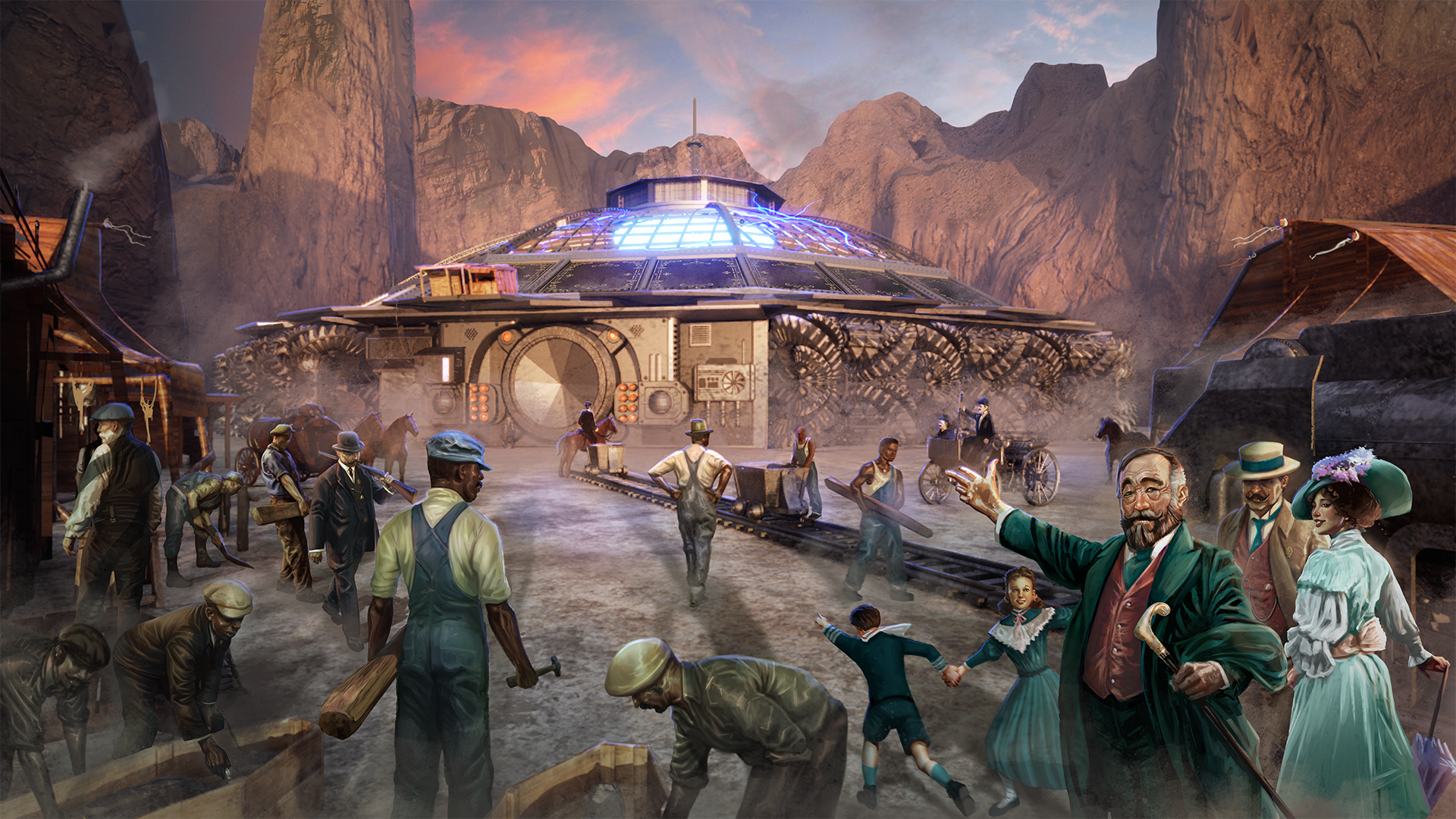
Developing environments and settings for Our Brilliant Ruin, “Every place tells a story,” comments Andy. If it’s a natural environment then this is a geological story, a human-made place like a homestead or manor house, then it tells human stories.
Andy’s storytelling rabbit hole approach to concept art is back: “Sometimes the story starts with a name, like the ‘Filthy Rita’, a great spot for the Unbonded to get a drink or conduct business. It isn’t so filthy now, but in earlier times it was a posh, exclusive place for high-ranking seafaring folks named the Emerita. It got pretty shabby when ‘The Ruin’ destroyed the seas but a shrewd Unbonded guy won it in a poker game and restored it to its current glory. The memory of its former shine and subsequent disrepair lives on in its ‘Filthy’ moniker.”
Andy tells me an early idea for the environment design of Dramark was for a green and gloomy world, “a gothic exaggeration of the British Isles,” which spun out questions for the concept art to solve – How does place become generally gloomy? Why is it generally verdant?
Every object, building or person should feel like they have a backstory and feel lived in
Efrem Palacios, senior concept artist
The art director details the thought process: “We discuss, bounce some ideas around and realise there is probably a lot of humidity for that fog and gloom to happen, and that makes the moss and plants happy, so you would have lots of foliage. So maybe the Dramark is close to the ocean. And we also wanted some mountainous areas so we connected that to the gloom and the shade of the mountains. With the context that ‘The Ruin’ is some form of poisoned light, maybe the gloomy shade of these mountains is a bit of a shield somehow and that’s why the Dramark is the last holdout for the people of this dying world.”
Efrem says nothing in the world design of Our Brilliant Ruin is ugly or pretty, damaged or glamorous without having a reason to be that way. “Every object, building or person should feel like they have a backstory and feel lived in,” he says, adding: “As for my own approach to making things I’m always making up a backstory to my creations. They don’t always or even usually get used because that’s just how I inspire myself to make something. Hopefully what comes out inspires the imagination of the writer or user who sees the art.”
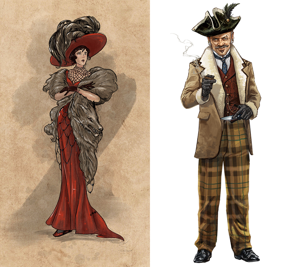
The first project to release in the world of Our Brilliant Ruin is the tabletop RPG book. This book has been a testbed to trial the visual design of the world being created, and even within this one book the art team has uses myriad styles and treatments.
The idea has been to “wrangle and embrace the chaos”, says Andy, and allow the differences in styles to shine, reflecting the “chaos and eclectic variety of the ruined world of Our Brilliant Ruin”. In the book the mix of styles is anchored by a grid layout with a unified typography (mostly), repeated elements and a finite colour palette.
Efrem notes that our world also has multiple art styles, design rules and aesthetics and yet always feels cohesive. He explains: “Our world has multiple styles and approaches to art and to make things feel real. We did the same and I feel we’ve embedded that with the overall design of the world from its graphics, typography, and architecture.”
Andy tells me how this has worked out well, and particularly unifying the colour palette has helped draw everything together. He says: “The images that stood out or clashed were brought into harmony by adjusting the colour or using a colour overlay to give the aberrant colours a better relation to the palette of their neighbours. So I’m a strong believer in approaching colour like a painter, where you have a small set of colours and derive all other colours from the mixture of that initial set.”
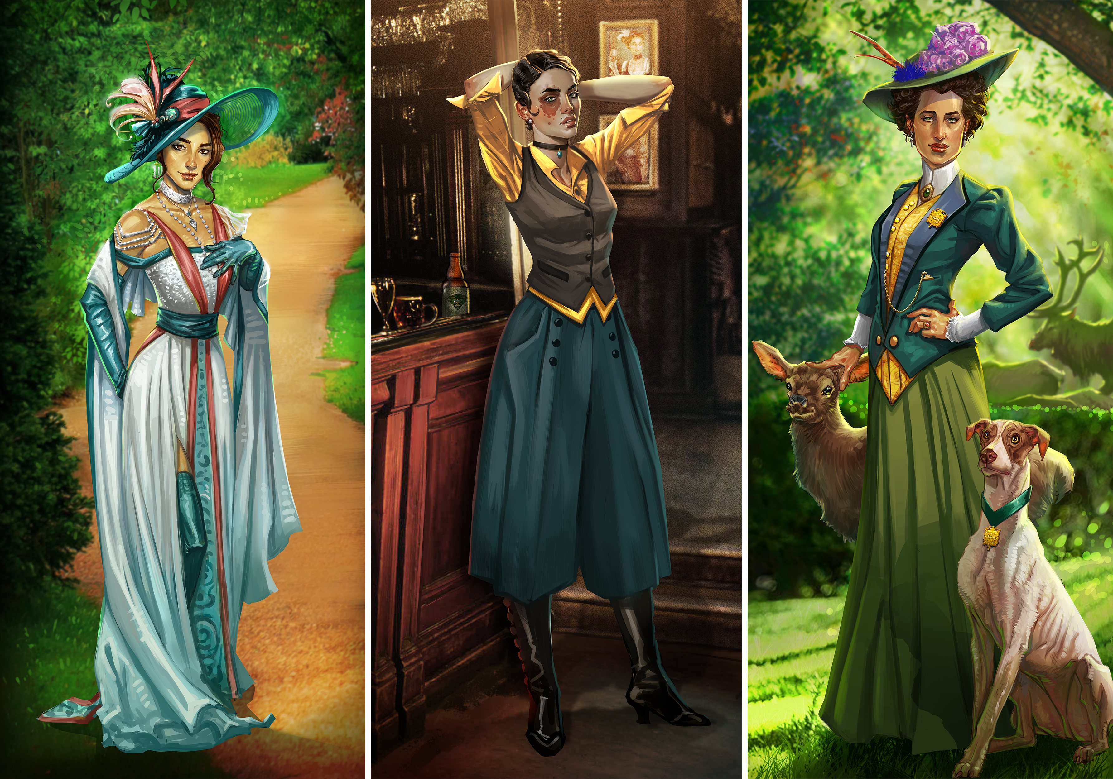
With the tabletop RPG nearing completion, it will be interesting how Our Brilliant Ruin evolves across different mediums – the graphic novel, podcast and video game are all in development and promises the same mix of styles, each release building and expanding on the world Studio Hermitage is creating.
“I’m really proud of the world we’ve built and the cast of fantastic characters that are part of Our Brilliant Ruin,” says Andy. “I think we have a beautiful sandbox for people to play in and I look forward to seeing what people do with it!”
Efrem jokes: “To quote Short Round from Temple of Doom, it’s all about the “Fortune and Glory” I’m eventually going to get from being a part of this awesome project. Either that or how I somehow convinced the team that having my pug and a Baboon with a cigar in its mouth is perfectly okay in the world of Our Brilliant Ruin as a piece of art … And I got paid for it!”
The Our Brilliant Ruin tabletop RPG can be pre-ordered on Kickstarter now. If you’ve been inspired my Andy and Efrem and the world Studio Hermitage is building, then why not grab one of the best drawing tablets, a copy of Photoshop or one of the best laptops for drawing, and get creating.

