


It’s been a wild off season in jersey news for the Kansas City Royals.
The Royals just a few weeks ago announced one of the ugliest advertising patches anyone’s ever seen on a Major League Baseball jersey.
READ: Kansas City Royals Introduce New Worst Ad Patch In MLB
But in much more positive news, a new report from UniWatch revealed an unnoticed aspect of the Royals’ uniform set that’s a vast improvement over what the rest of the league has been wearing. The lettering for the names on the back of the Royals jersey are the same height as they were in 2023.
Every other team though, has seen the size of the letters shrink dramatically. And the contrast makes the new jerseys look even more absurd than they already did.
The size of the letters is visible in photos posted by the Royals X account:
And it’s easy to see the difference between their style lettering and other teams.
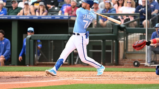
SURPRISE, ARIZONA – FEBRUARY 26: Carter Jensen #74 of the Kansas City Royals hits an RBI double against the Chicago Cubs during the second inning of a spring training game at Surprise Stadium on February 26, 2024 in Surprise, Arizona. (Photo by Norm Hall/Getty Images)
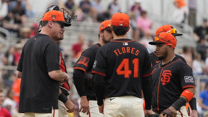
Feb 26, 2024; Scottsdale, Arizona, USA; San Francisco Giants amanger Bob Melvin talks to his players in the third inning against the Los Angeles Angels at Scottsdale Stadium. Mandatory Credit: Rick Scuteri-USA TODAY Sports
Looks much better, doesn’t it?
Kansas City Royals Show How Nike Messed Up A Very Easy Assignment
The jersey fabrication change has received mixed reviews, but different materials are easy to get used to. There’s another argument to be made that, in some cases, the jersey tops actually fit better than in years past.
All Nike had to do was update the fabrics to be lighter, without changing much of the way the numbers and letters were displayed on jerseys. That’s what it looked like they’d done in the 2023 All-Star Game. Instead, they shrunk them, added a bizarre curvature, and inexplicably lowered the MLB logo.
Uni Watch reported that the Royals were the only team to receive a waiver to stick with the old lettering style, essentially because they demanded it. “Everyone was supposed to get the smaller letters,” the article reads. “The Royals essentially got a waiver because they lobbied hard for it.”
Nike and MLB have defended the new jersey style and lettering as having performance benefits due to lighter fabrication and materials. Uni Watch asked the Royals if they were concerned about their player’s performance thanks to having “heavier” bigger lettering. Unsurprisingly, considering they must weigh approximately 0.2 ounces, the answer was a resounding “No.”
The absurdity of saving a miniscule amount of weight with smaller letters while teams put massive ad patches on their sleeves perfectly exemplifies this entire disastrous situation. Nike and MLB focused on fixing problems that didn’t exist, leading to see-through pants and laughably small lettering.
The Royals show how much better the new jerseys look with fewer changes. It could have been so easy.